Clear space
The letter P provides the reference for clear space. Breathing room preserves the signature and prevents interference from surrounding elements.

An identity bringing architecture and execution together.
Precision as a language.
Coherence as a principle.
Coplanar starts from the idea that design and construction should operate together. The identity translates this approach into alignment, typography and relationships between planes, balancing technical rigor with understated warmth.
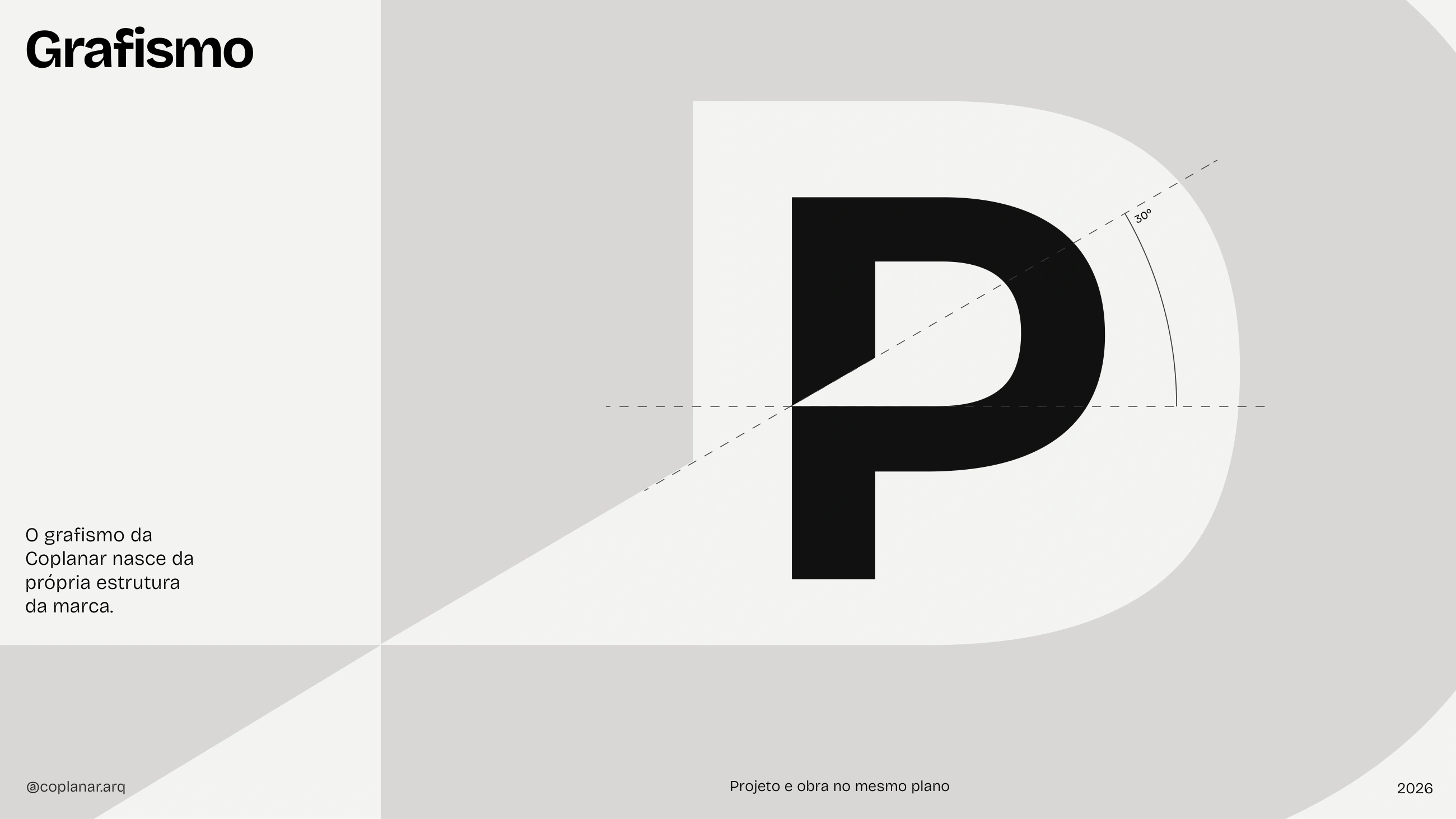
The starting point is coplanarity: distinct elements sharing the same plane. A horizontal and a diagonal make this concept recognizable across different formats.
The horizontal wordmark is the primary signature. The customized P adds a distinctive detail while preserving an institutional character.
 Original vector artwork
The letter P provides the reference for clear space. Breathing room preserves the signature and prevents interference from surrounding elements.
Minimum width: 20 mm in print and 175 px in digital applications, as specified in the brandbook.
Preserve the original proportions, spacing and official colors. The stacked version is an alternative for specific formats.
Neutrals structure the identity. Blues extend the palette with a restrained presence.
Official brandbook values. Select a color to copy its HEX code.
Bricolage Grotesque carries headlines, highlights and body text. Hierarchy is built through weight and proportion.
The system supports scales built around a 1.618 ratio. Relationships adapt to content and format rather than imposing one fixed size.
Segoe UI is the specified system alternative for email, shared documents and environments where the primary family is unavailable.
Graphic elements behave as a system: horizontal, diagonal and grid maintain alignment as the composition changes.

Projeto e obra
no mesmo plano.
An adaptation demo using the original graphics. Formats illustrate the system's behavior.
The graphic language grows out of the wordmark. The relationship between horizontal and diagonal recurs throughout the compositions.
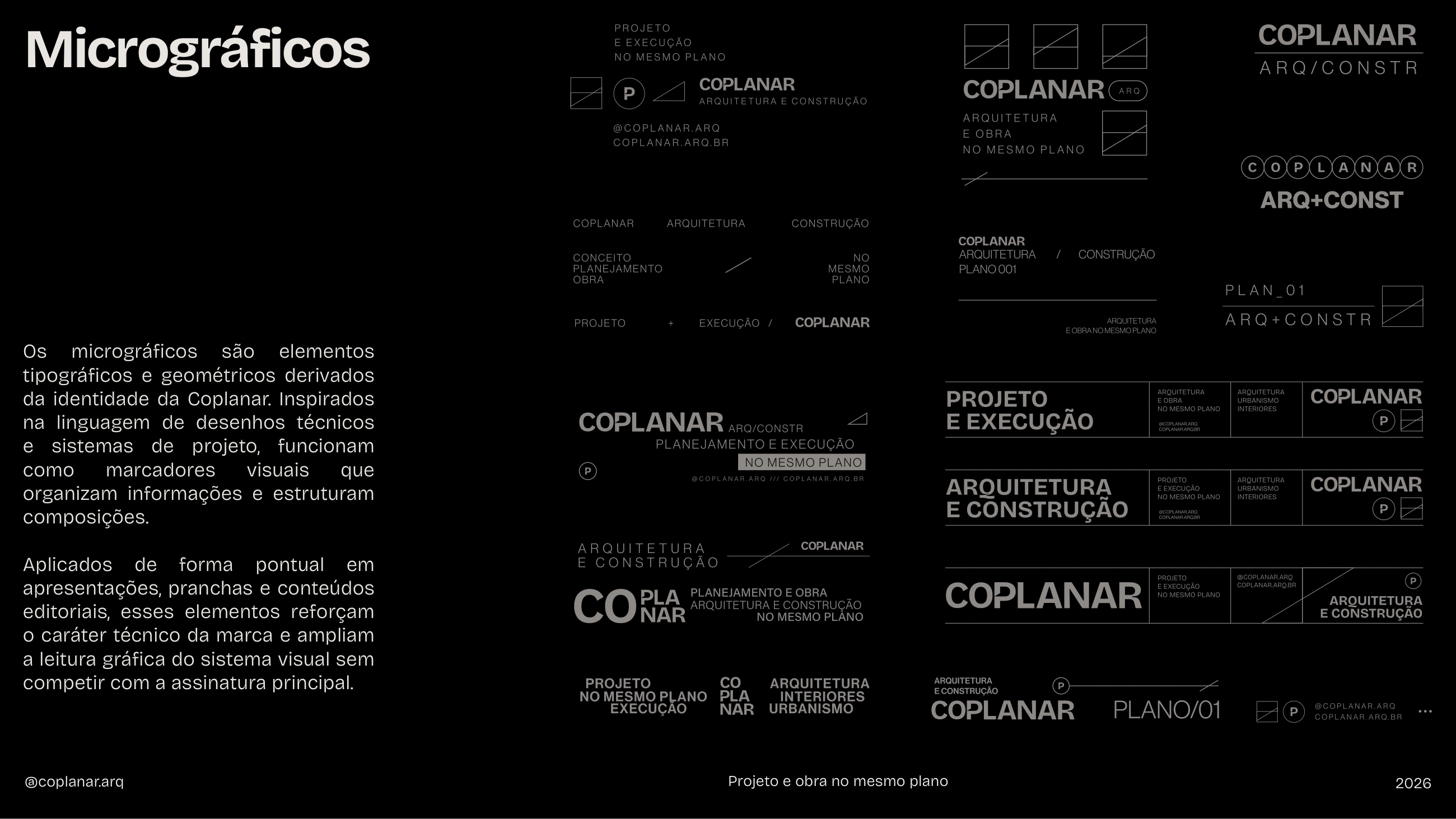
Codes, markers and technical elements organize information without competing with the signature.
From project presentations to signage, the identity maintains a recognizable structure.